

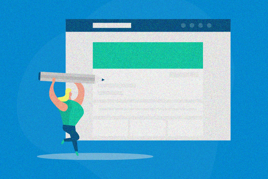
One of the most overlooked items of a referral marketing program is the referral landing page, where people sign up to join your referral program. You have thought about all aspects of your referral marketing campaign in great detail. Now you need to figure out how you’re going to display the program.
You may be wondering what components you need to have a successful landing page redesign. Don’t worry: Wev’e got you covered with our list, including some of the best referral landing page examples.
Creating a successful referral landing page: Why it’s vital
You want your referral landing page to be appealing, convenient and informative. The landing page will either make someone want to sign up or it will make them run.
If something looks confusing, boring or difficult, chances are the user will exit without giving it a second look. This means you won’t get as many new customers through the program (because if customers aren’t sharing, you won’t see a boost in conversion rates).
But an appealing landing page will increase your referral rates, generate more word of mouth, and mobilize more customers as brand ambassadors, bringing a higher likelihood of new customer conversions.
Key elements for your referral landing page
There are a few key template ingredients that will help you create the perfect landing page for your customer referral program:
- Catchy headline or title
- Navigation
- Imagery
- CTA
- Benefits of referring
- Elements that make sharing easy
Here’s how they come into play, along with examples that show these elements at work.
1. Catchy headline or title
People don’t select things that have lackluster names. Catchy things trump all. The same goes for your landing page. If you don’t “WOW” someone, they will not explore the page that long. This is the first thing someone will read when they land on the landing page. So make the referral program headline intriguing so that the user wants to read more.
Things to consider:
- Is it simple? Make it easy for potential users to understand.
- Is it uncomplicated? Complicated and gimmicky make it less appealing to customers.
- Is it applicable? If it’s not relevant to the user – chances are they won’t be interested.
Do you need help creating a catchy headline? Here are 5 easy tricks to write catchy headlines, by Jeff Goins. Make sure you follow him on Twitter @JeffGoins.
Here is a good example of a simple yet catchy headline. Trendy Butler gets right to the point with what this landing page is all about. Plus, they mention the purpose of the page. Boom – (the What) “Friends and Family Program”. Bam – (the why) “$10 for every sign up”. They kept it simple, uncomplicated and applicable to their customers.

2. Navigation
Navigation to your landing page is essential. If your users have a hard time navigating to and from the page, well things might crash and burn. Your best bet is to be simple and visible. You may opt to have your referral program as its own option on your navigation menu. Or it may perhaps be a secondary option. You could also display a link to the referral program elsewhere on the homepage.
Things to consider:
- Is it over the top? Yes, you want it to be noticeable, but remember it’s not an attraction at the zoo. You still want your main content to be seen. So, blinking lights are not necessary.
- Is it confusing? From now on, just note that things need to be simple. Always. Navigating the landing page or your site, for that matter should not be confusing. If it is, then you can kiss conversions goodbye.
Here is a perfect example of landing page navigation (or navigation to get to the page). Dappertime places a link to their referral program page right on their main site menu. This will allow their customers to easily find the landing page, and take action. They make sure it’s findable without being over the top or confusing.

3. Imagery
You need a hero shot. You need one main image that will impress and explain the purpose of the landing page. This image is not meant to be a bystander on the page – it’s supposed to take center stage. The sole purpose is to use this one image to tell the story. Or give off a particular feeling (i.e: happiness or excitement are good things to aim for). This image will explain what words are unable to. Sure, you can use other imagery – but don’t let things get too cluttered.
Things to consider:
- Is it relevant? Make your images do the talking for you. If you’re a cupcake shop, you may not want to use a burger as the hero image on your landing page. Unless you can somehow make it relevant to you, steer clear.
- Is it gripping? It’s called a “hero image”. This image needs to help catch attention. Pair a great, clear and meaningful image with an awesome title, and you’ll be all set.
A stunning example of imagery. Greats referral program landing page looks clean and sharp. Plus, they used a killer hero image that displays what they’re all about. They display the image right above their text, and voilà, it’s easy to follow along with this landing page.

4. CTA
You need something that lets the user know what their next move should be. Take the guesswork out of it by using a clear call to action. The call to action should be an actionable word, that also informs the user of what they are about to do. “Register”, “Sign Up”, “Earn Now” are simple, yet effective CTAs.
Things to consider:
- Is it insightful? Make sure the user has a clear understanding for what they are clicking on.
- Is it catchy? The call-to-action button should stand out. Again, this doesn’t mean light it up like the Hollywood sign. It just means that the button needs to be clear and visible.
- Is it easy to find? CTA placement is important. If it’s in a weird location, people may glance over it. If you are using a scrolling page and it’s located at the bottom, after 6 pages of content, it may never get clicked. The CTA is important, it’s how you convert your users into your program members. (Note: If you do have a long scrolling page – have a CTA in many locations. Try on or under the Hero Image, at the bottom of the page, on the side as a static option). No matter where you may place your CTAs, they need to make sense and be visible.
Let’s see an example of a good CTA. True&Co hits the nail on the head quite well. The CTA is clear. It’s placed in a findable spot. Plus, it’s catchy – not to mention it’s gold! Who doesn’t want to press a golden button?

5. Benefits
This is your opportunity to convince the user to sign up. Your landing page should give a clear sign why signing up for your program will benefit them. Describe the referral rewards, and other benefits, in the most interesting way possible. Make it so the user knows exactly why they should sign up.
Things to consider:
- Is it compelling? Make sure the user can understand how signing up will benefit them.
- Is it descriptive? Make sure you’re not just slapping the features down. Explain the benefits.
- Is it wordy? Yes, you want it to be descriptive, but keep things to a minimum. When things get too text-driven, the user may lose focus.
Need an example of good benefits? Wool Overs does a great job at explaining the benefits of joining their referral program. They use a short blurb to explain the benefit right under the headline. Wool Over keeps it short and sweet, but also informative.

6. Easy sharing
In addition to the CTA button, your referral landing page should have other elements that encourage easy sharing:
- Explain how to share the program, and what must happen to earn the reward, in a concise way. Keeping things to a few simple steps is best. Leave a good amount of white space, so things aren’t overwhelming.
- Keep form fields to a minimum for quick sharing.
- Give multiple options for customers to share with friends, including email and social media platforms.
- Once they’re logged in, give customers their referral link that they can copy and share anywhere.
Freshly gives existing customers loads of options for sharing, and concisely explains how the program works (including with the step-by-step list to the left). Plus, once they sign in, they get access to a unique referral link for even easier referrals.

Referral landing page examples
Need even more inspiration? Check out the high-quality referral program landing page examples below.
Harry’s
Razor brand Harry’s nails the benefits aspect with their tiered program landing page: they offer more rewards the more friends someone gets to sign up. The headline gets to the point, it’s easy to understand how the program works, and there are multiple options for sharing. And check out the eye-catching mammoth as the hero image!
Tip to steal: Running a tiered referral program where rewards increase with every successful referral? Try using a reward tracker like Harry’s does.

Omsom
We love how Omsom catches your eye with the yummy hero image, featuring meals you can make with the brand’s authentic Asian meal starter packets. The headline advertises the reward and grabs the customer’s attention with the fire emoji. Then, Omsom concisely explains how to reap those referral program benefits.
The CTA is easy to find, in purple with the “refer friends” text. And after someone has clicked, all they need to do is give their email and choose how they’ll share with a friend.
Tip to steal: The give and get headline is an awesome and catchy way to introduce your own referral program, especially if you’re offering similar rewards for referrer and friend.

MeUndies
MeUndies starts off strong with a super-catchy headline, then explains the rewards of sharing the brand. It’s easy for customers to start sharing, as they just need to enter their email and click the CTA. A humorous pre-written message for the referred friend, written in the referrer’s name, means existing customers don’t need to think of what to say before they invite friends.
Tip to steal: Create a message that sounds like the referrer wrote it, so it’s easy for customers to share. But give them room to add to their message for maximum authenticity.

MOO
MOO places the rewards right in the headline, and gets straight to the point by inviting customers to refer a friend. The hero image displays its own headline that also describes what customers will get for referring. And the seven sharing options (including several for social sharing, plus the direct copy of the referral link) really stand out.
Tip to steal: Although you don’t need two headlines, you might try to place headline text (or text describing the reward) on top of the hero image to draw people in. Just make sure you don’t make things too cluttered.

Tabbed Out
Tabbed Out is an awesome example of how to create a mobile app referral landing page. The page is easy to find in the menu, the reward is displayed promimently, and it’s super easy to tap and share the referral code. A referral tracker with “sharing status” and the amount earned is a great motivator. Even with no traditional hero image (the reward in the circle functions as the hero), it’s still an effective landing page.
Tip to steal: Over half of your customers will browse your site on mobile, so even if you don’t have a mobile app, you’ll need your referral landing page to be mobile-friendly.

The bottom line for a successful referral program landing page
Make sure that whatever imagery, wording, or CTAs you use on your referral landing page, the user knows exactly what the purpose is. You want to make the user confident in their decision and you want to avoid accidental clicks.
You’ll also find that a lot of these rules apply to your referral message, or the message the referred friend sees (which can be on a dedicated landing page in your program too).
Other things to consider:
- Add a FAQs section
- Use previous user testimonials
- Try to add a video or slideshow in place of a hero image
- Use a welcome widget
- Add a form right to the landing page
- Have the landing page display like a pop-up
It’s also good practice to optimize your landing page to bring in the most shares. Optimization involves A/B testing different variations of your landing page, to see what copy, images, and layouts work best. Continue testing the best-performing landing pages until you’ve found a consistent high performer.
See other awesome referral programs here.